EVANESCENT
Adults in urban enviroments get stuck in repititive mundane routines, losing their curiosity and wonder.
In this project, I explored the how a strong narritive can be paired with speculative design to impact social change.
Specialty
Brand Identity
Narritive Directing
Photography
2026
Client
Academic
Group Project
SOLUTION
Disrupt adult commuters with a breif escape from reality, using a perspective changing exibition that entices curiosity and interaction.
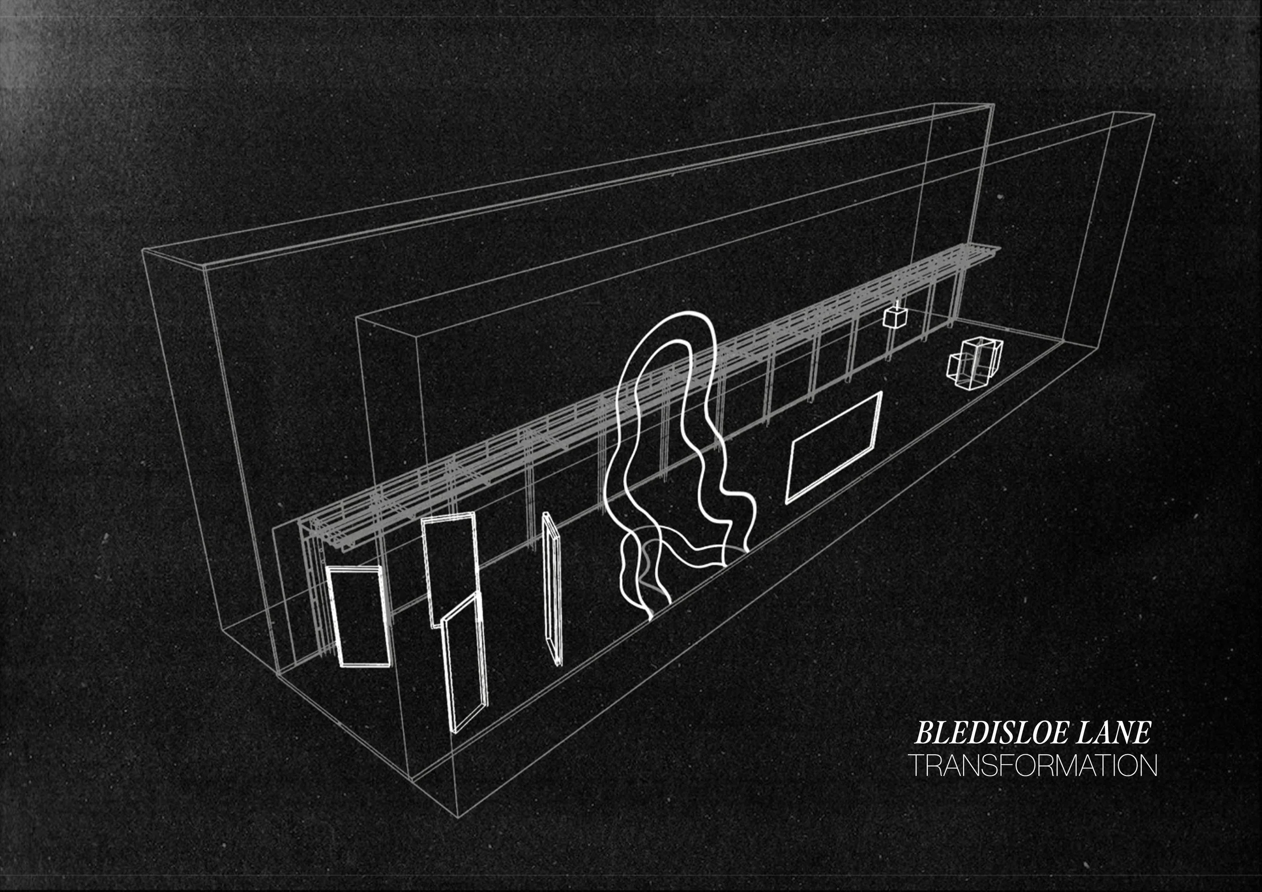
THE EXIBTION
The exibiton is located in Bledisole Lane, a urban alleyway right between two major hot spots that is void of any life, a liminal space that serves no purpose aside from a mundane passing in a commute.
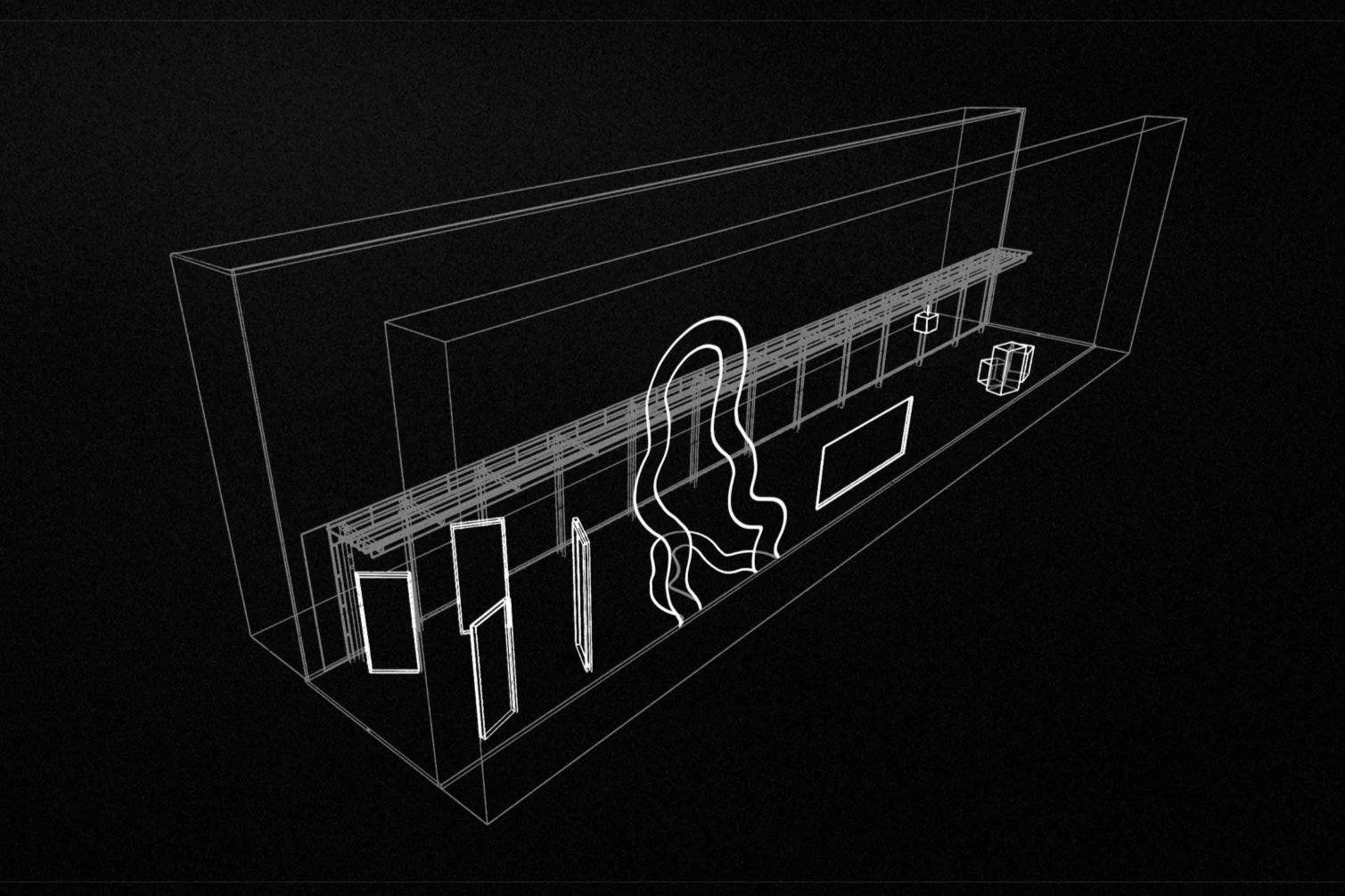
Evanscent transforms this mundane passing into a other worldly expereince. Featuring four curiosity driven experiences, that each offer a unique interaction and narritive.
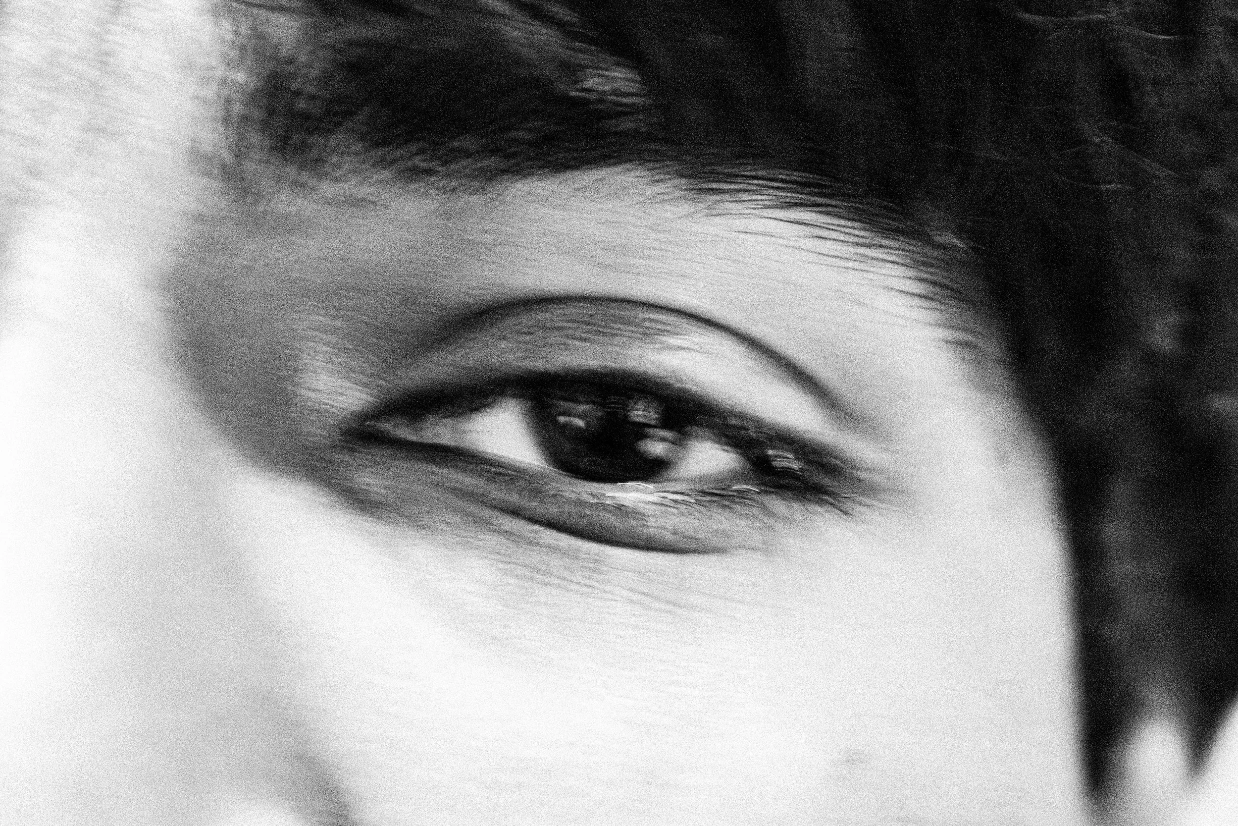
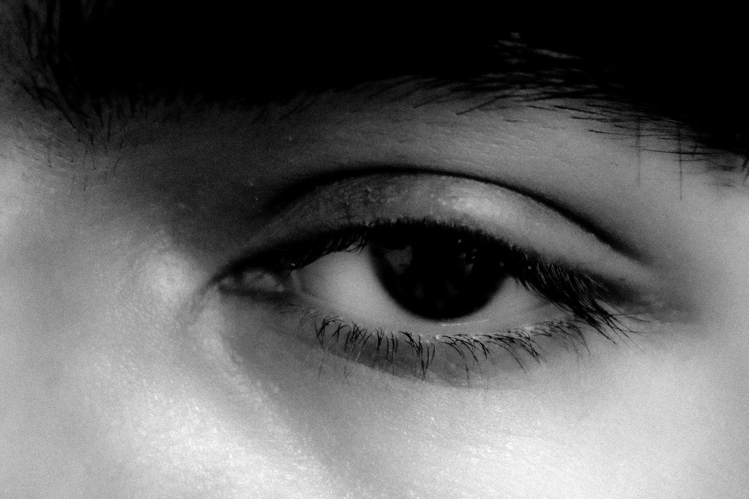
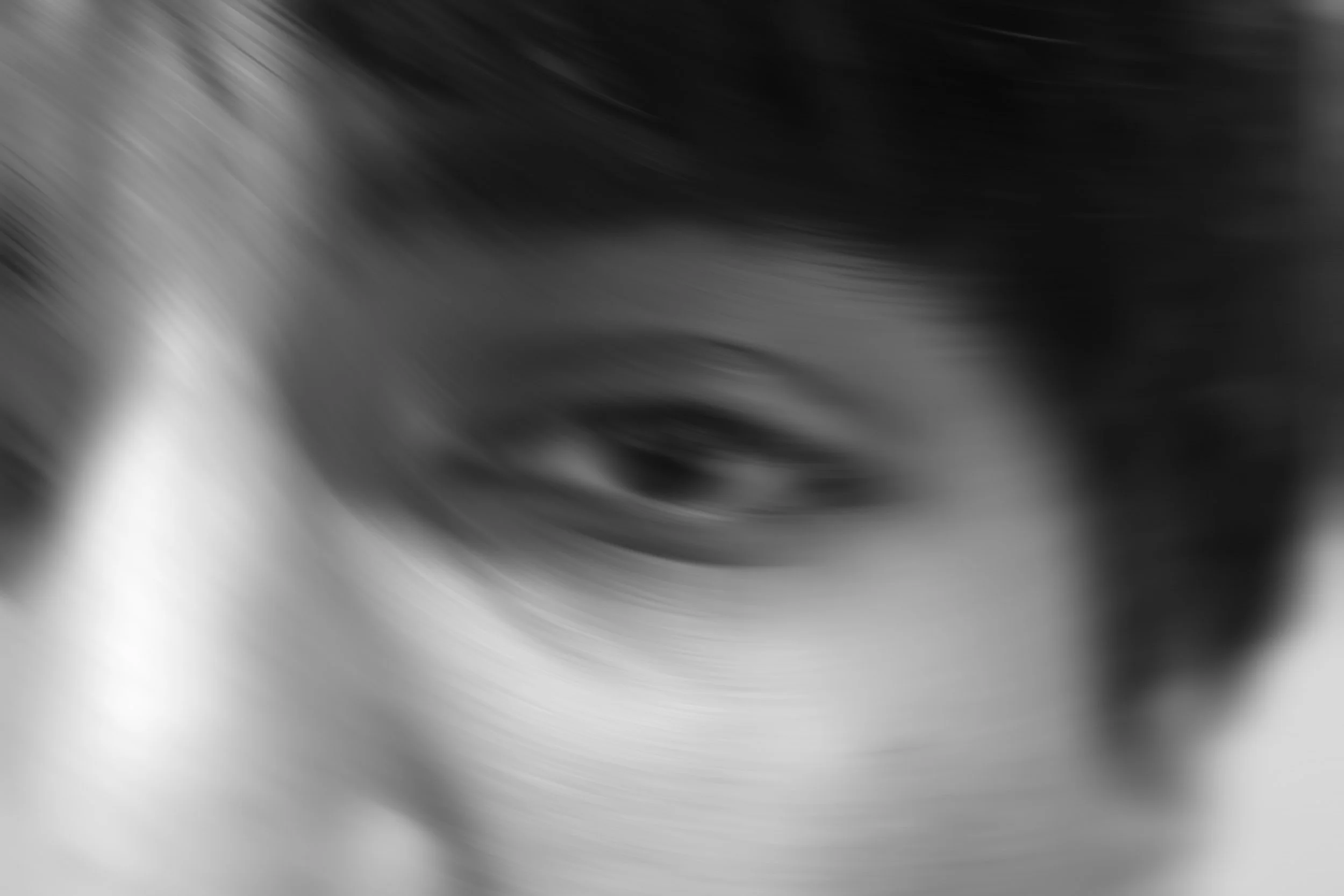
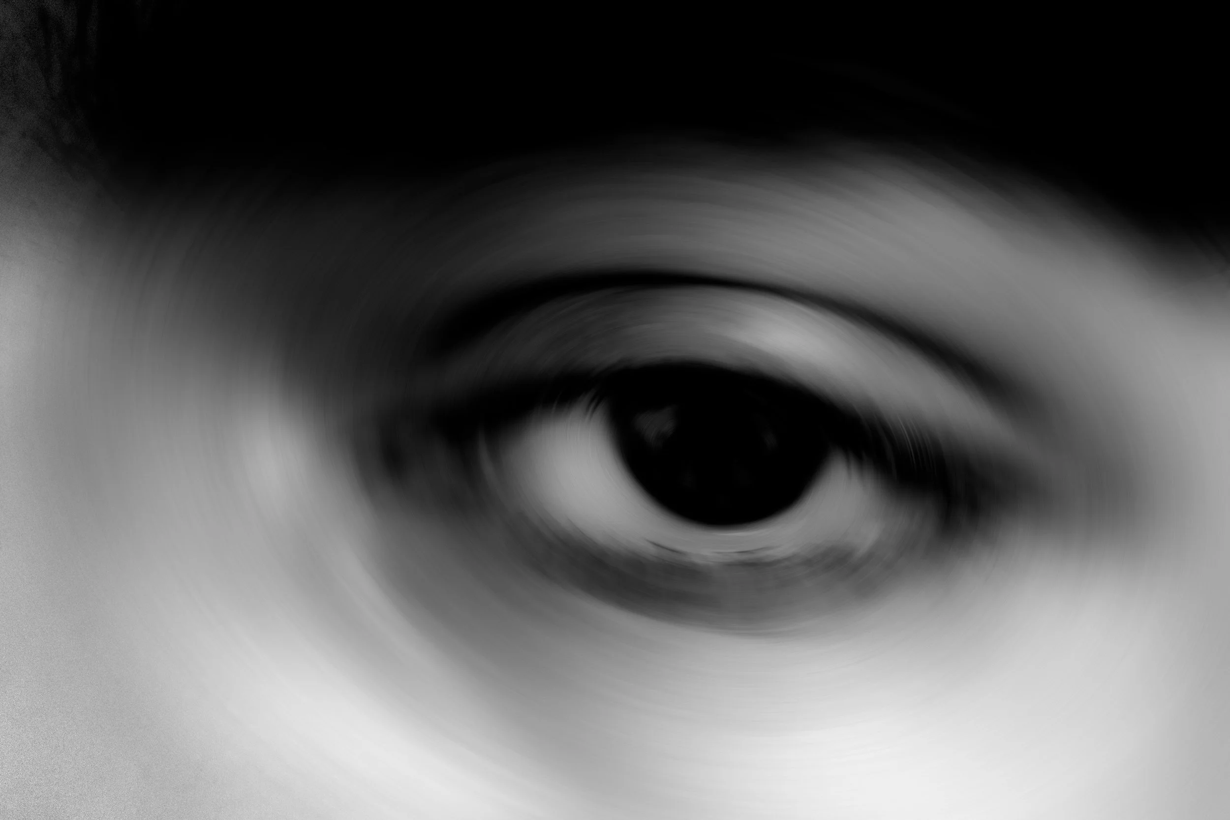
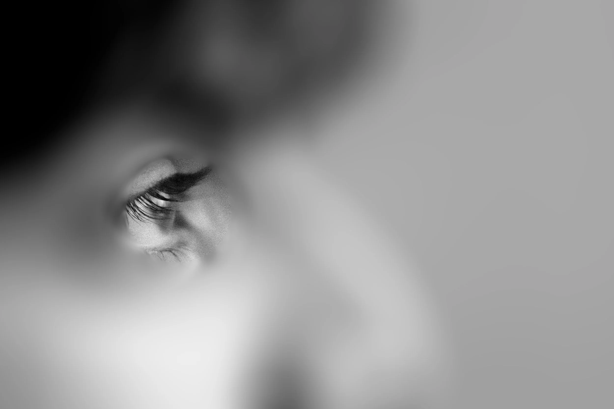
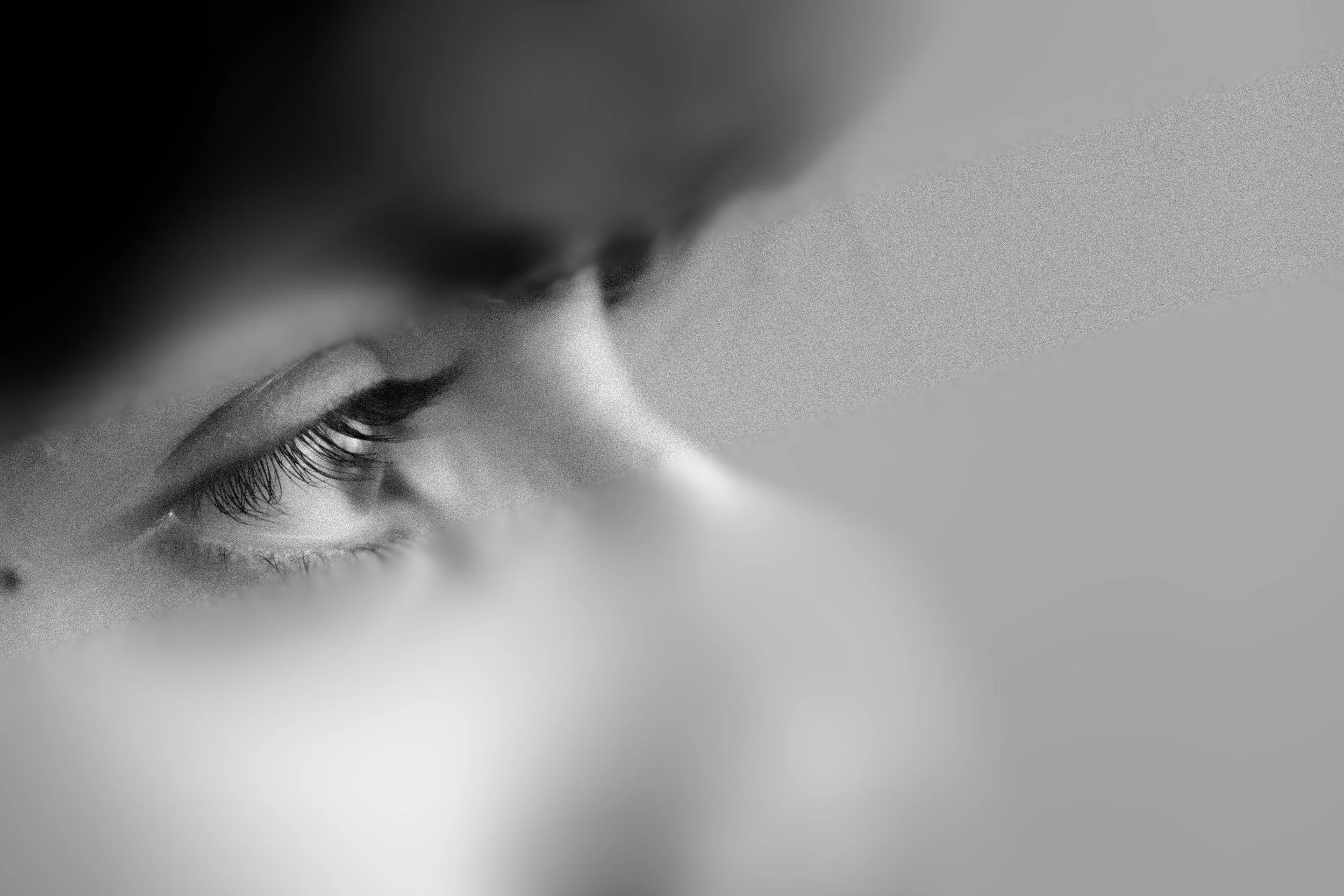
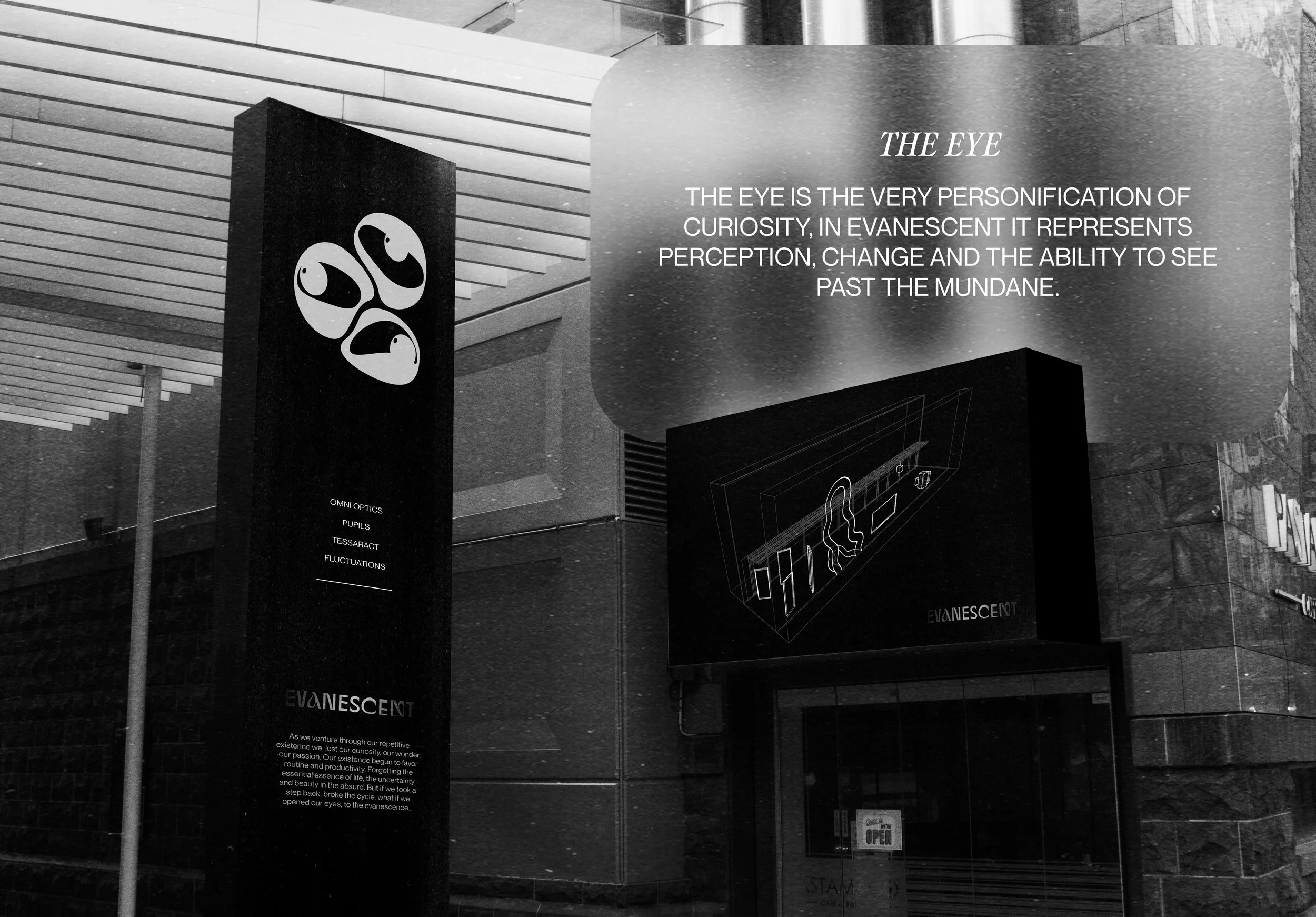
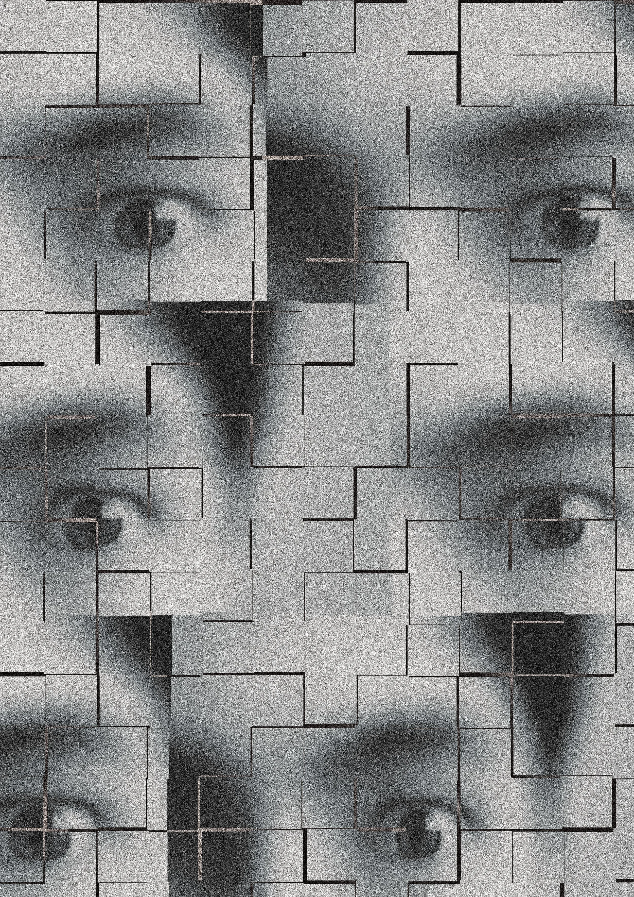
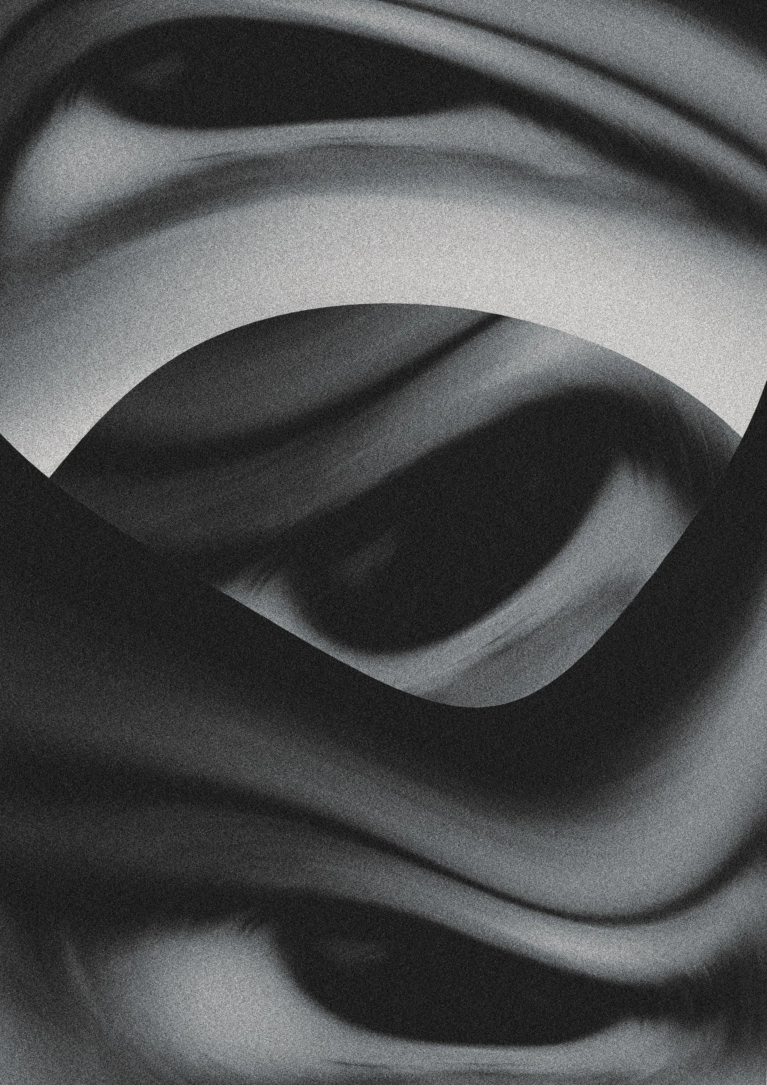
THE SYMBOL
The eye is a recurring motif in the Evanescent brand, The Eye is the very personification of curiosity, in Evanescent it represents perception, change and the ability to see past the mundane.
Evanscent transforms this mundane passing into a other worldly expereince. Featuring four curiosity driven experiences, that each offer a unique interaction and narritive.
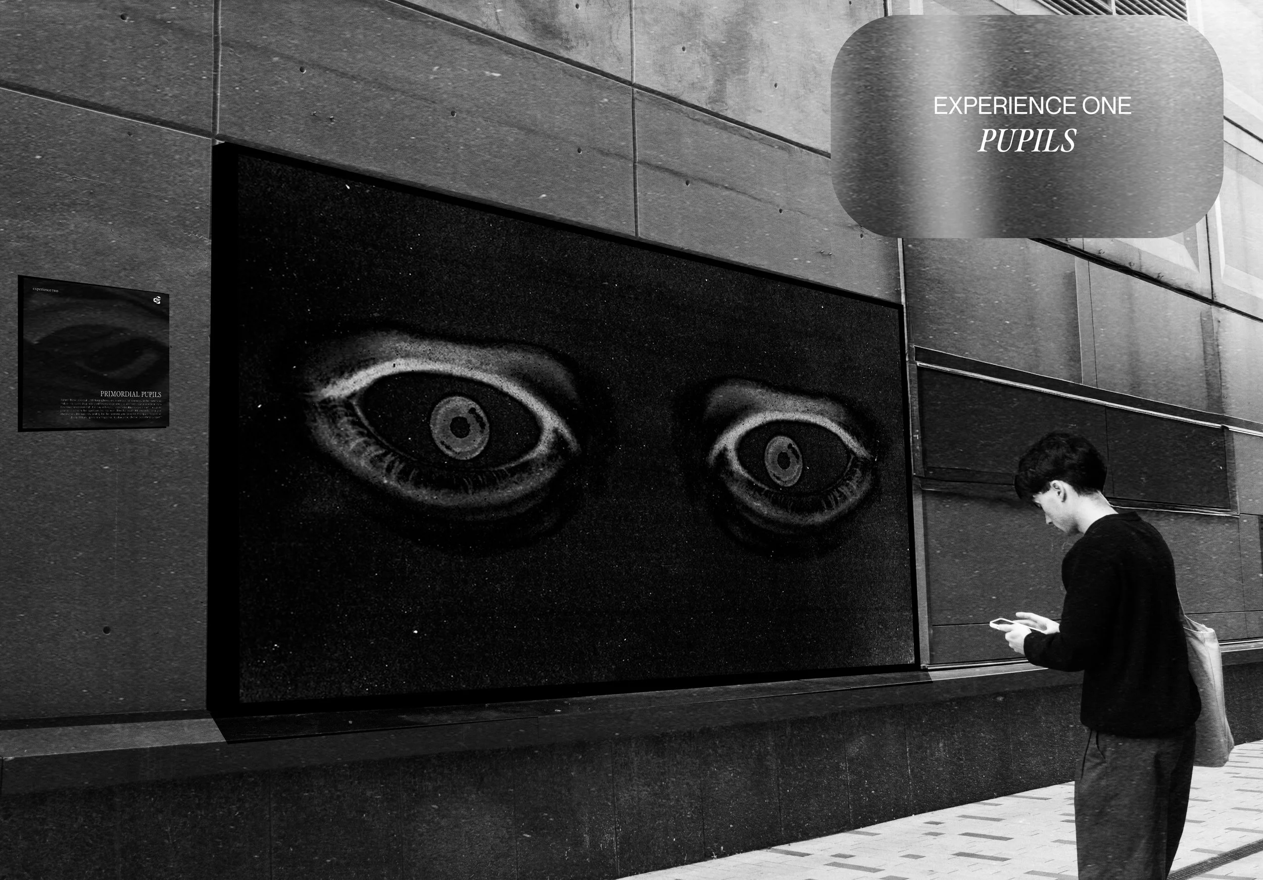
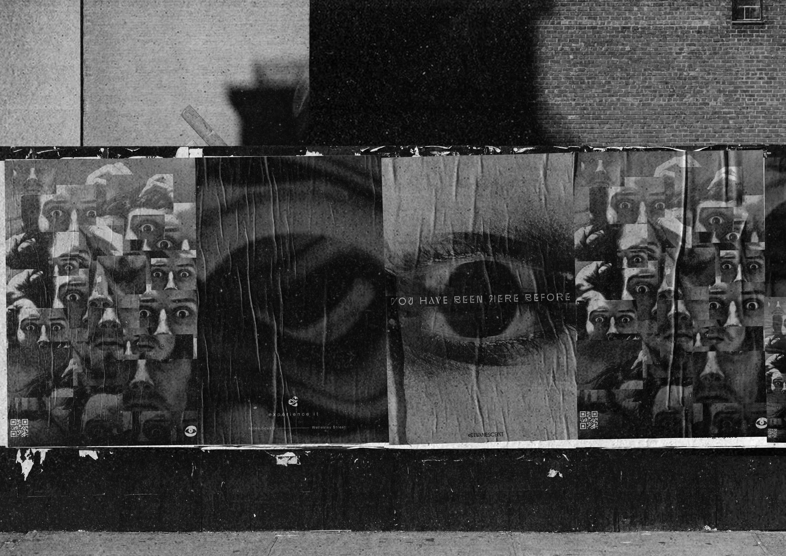
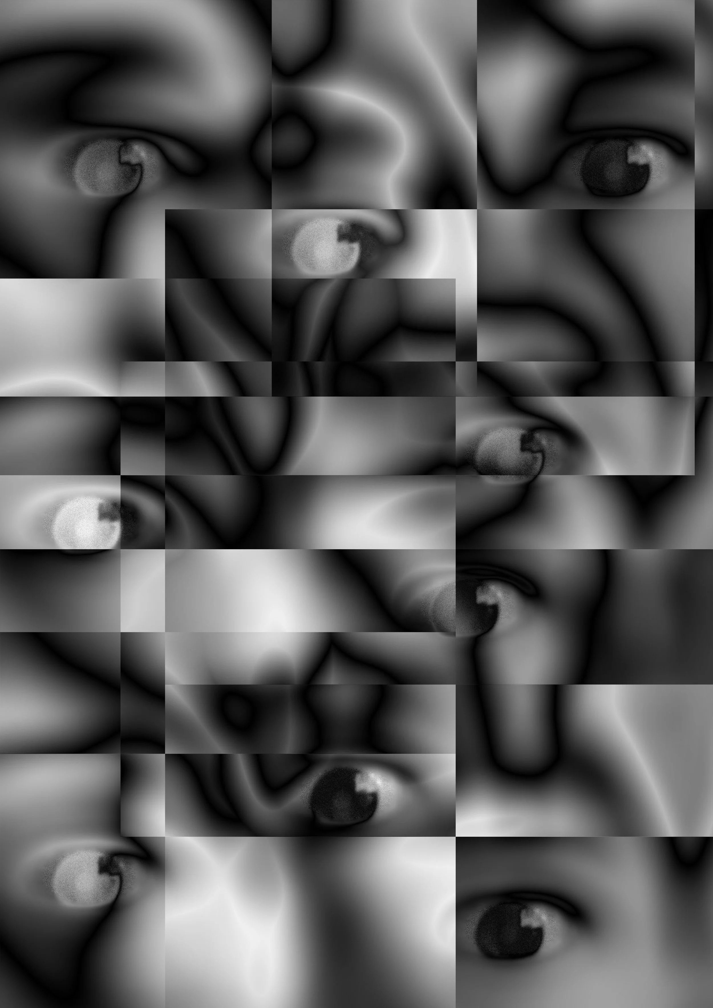
POSTERS
A series of surreal posters are placed throughout urban environments. Designed to feel uncanny and attention-grabbing, the posters use recurring eye imagery as a symbolic reminder of the exhibition’s central theme of perspective and perception. These visuals act as subtle interruptions within everyday city life, encouraging viewers to stop, question what they see, and engage with the narrative Evanscent explores.


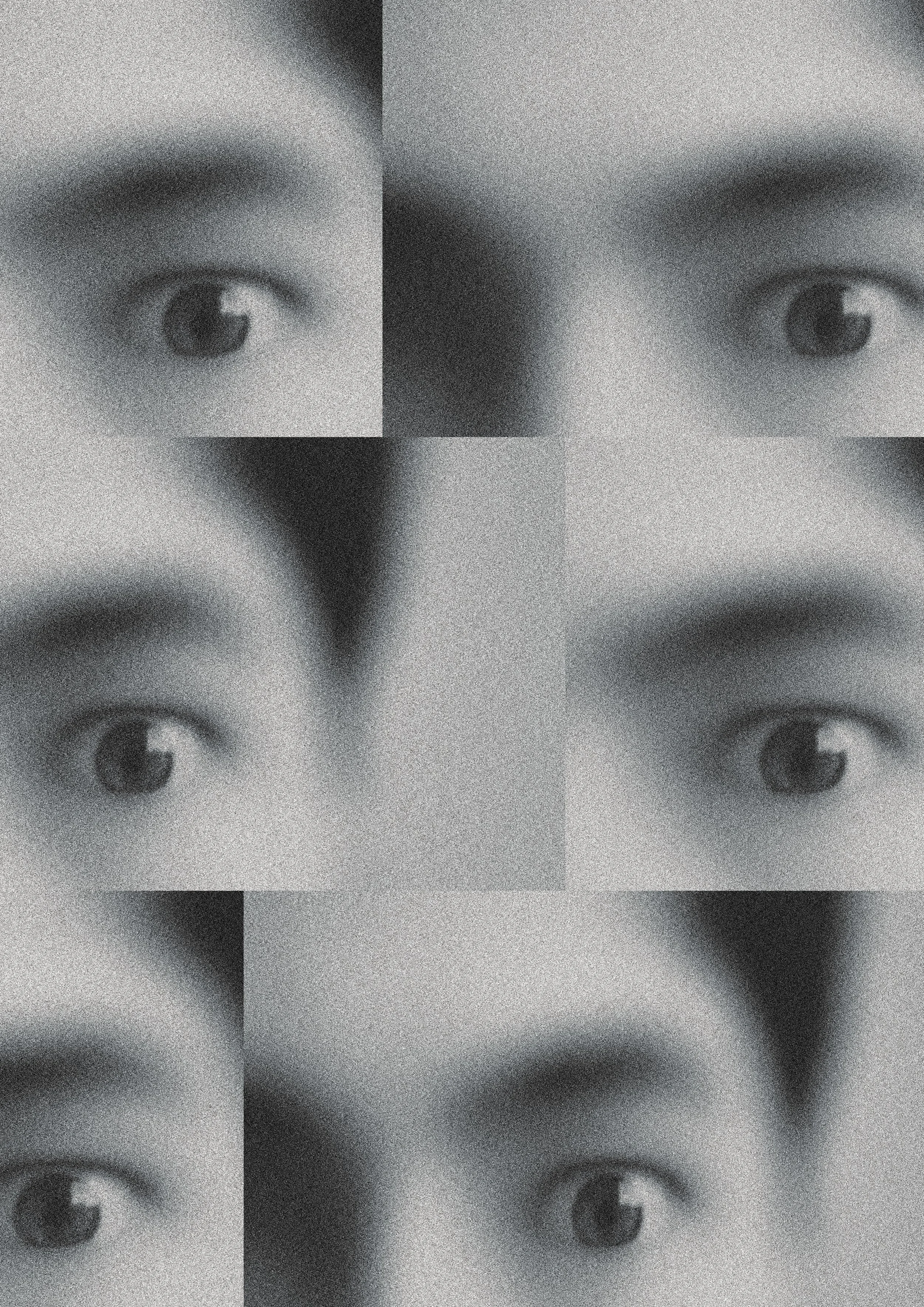
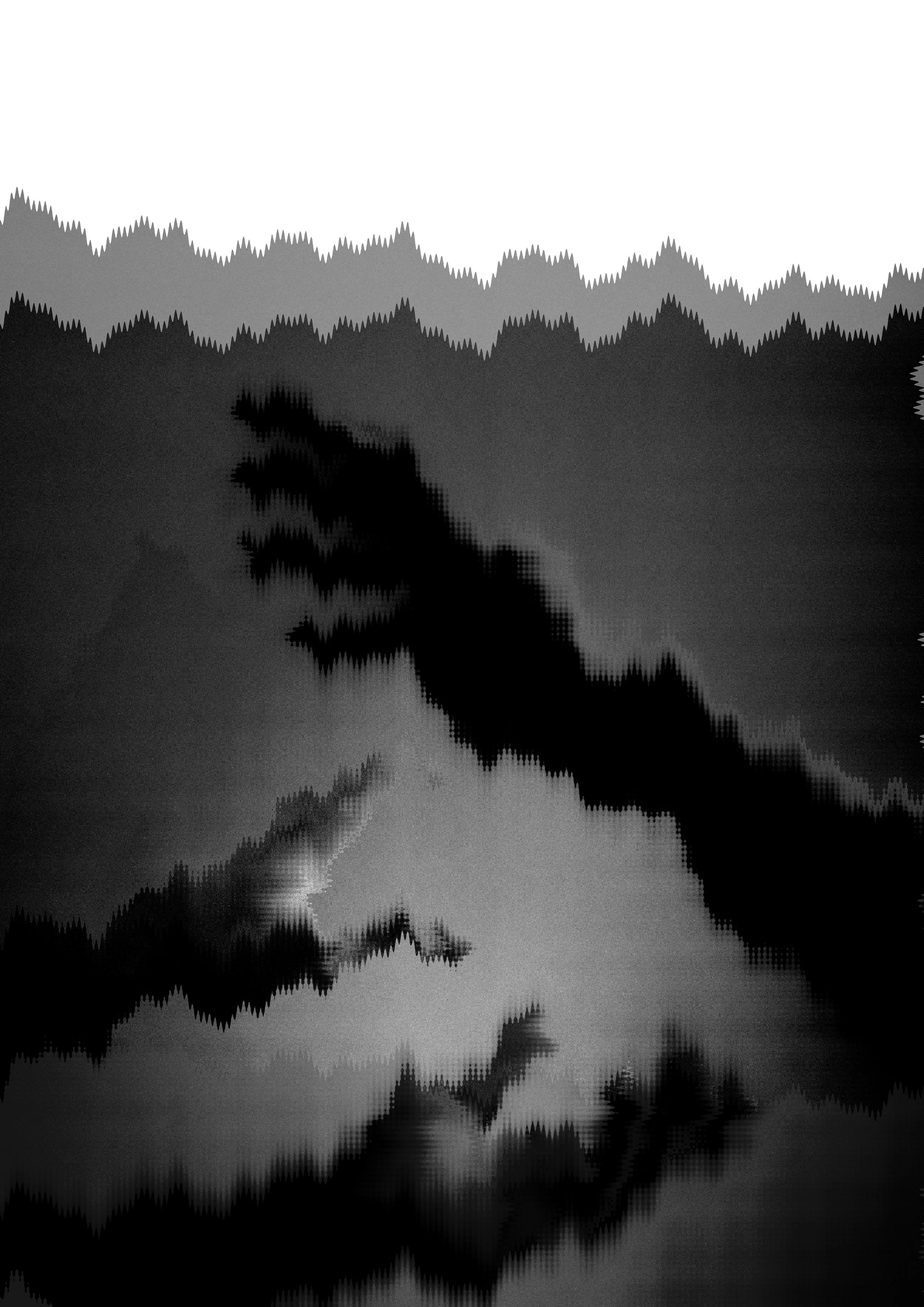

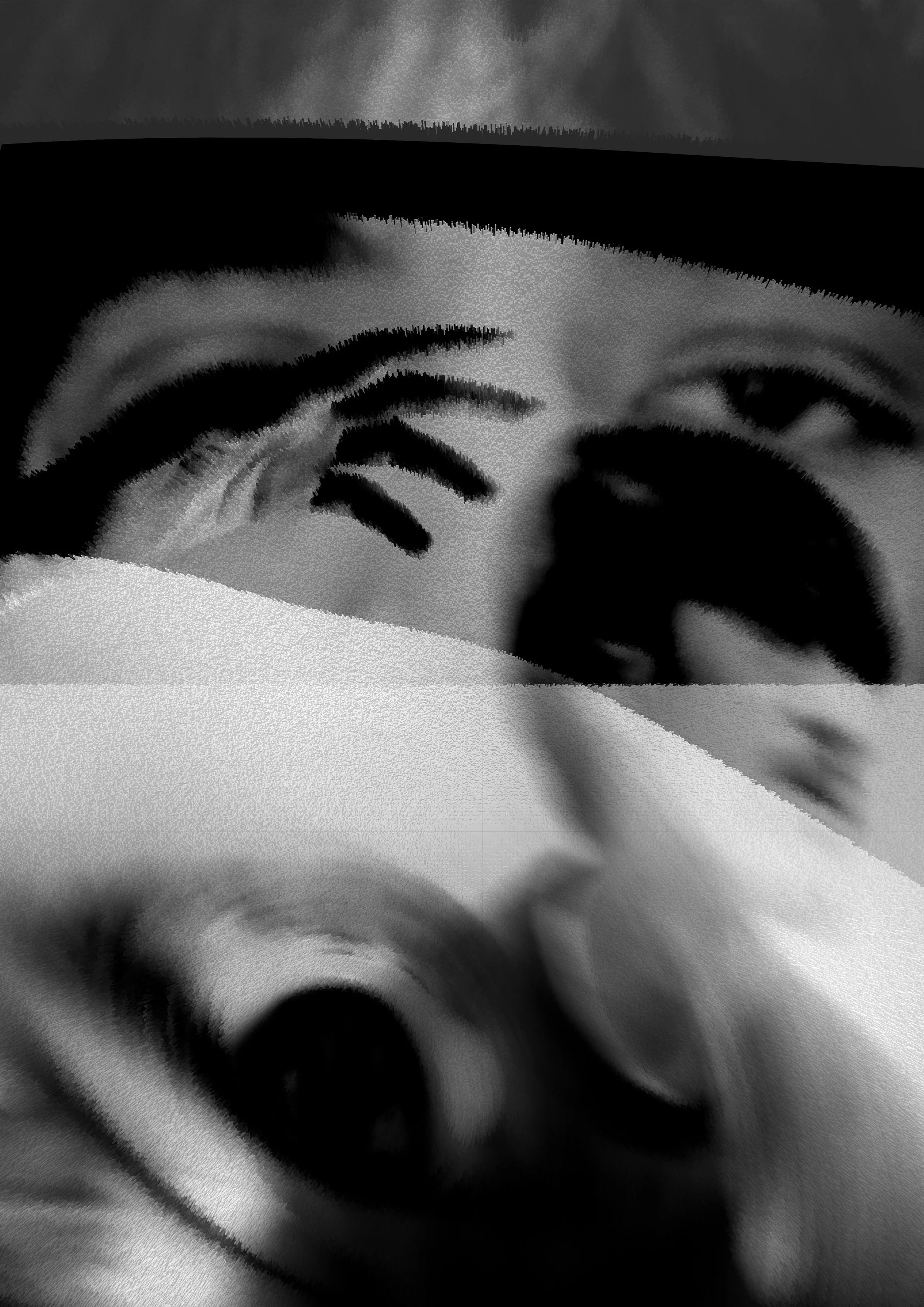

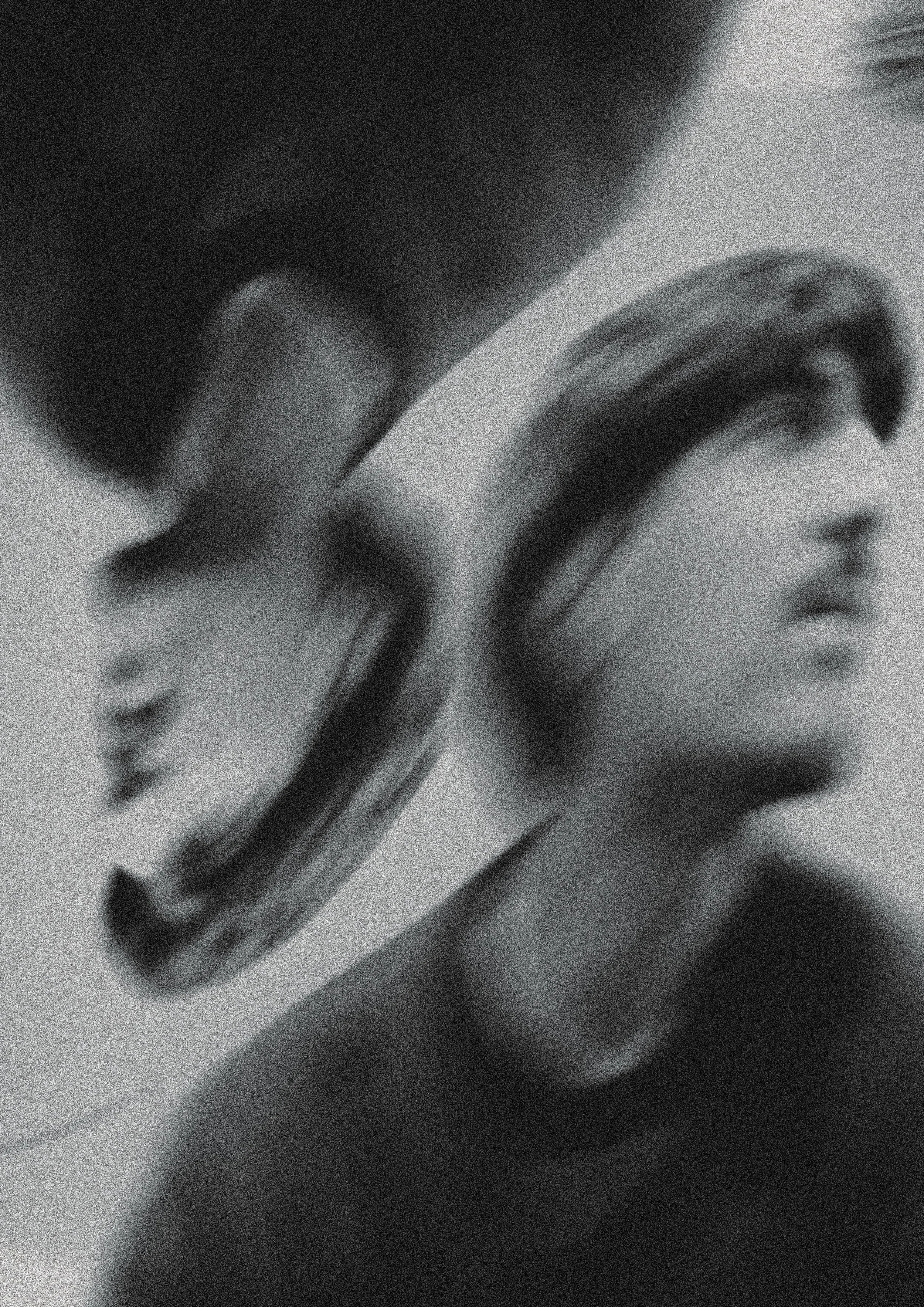
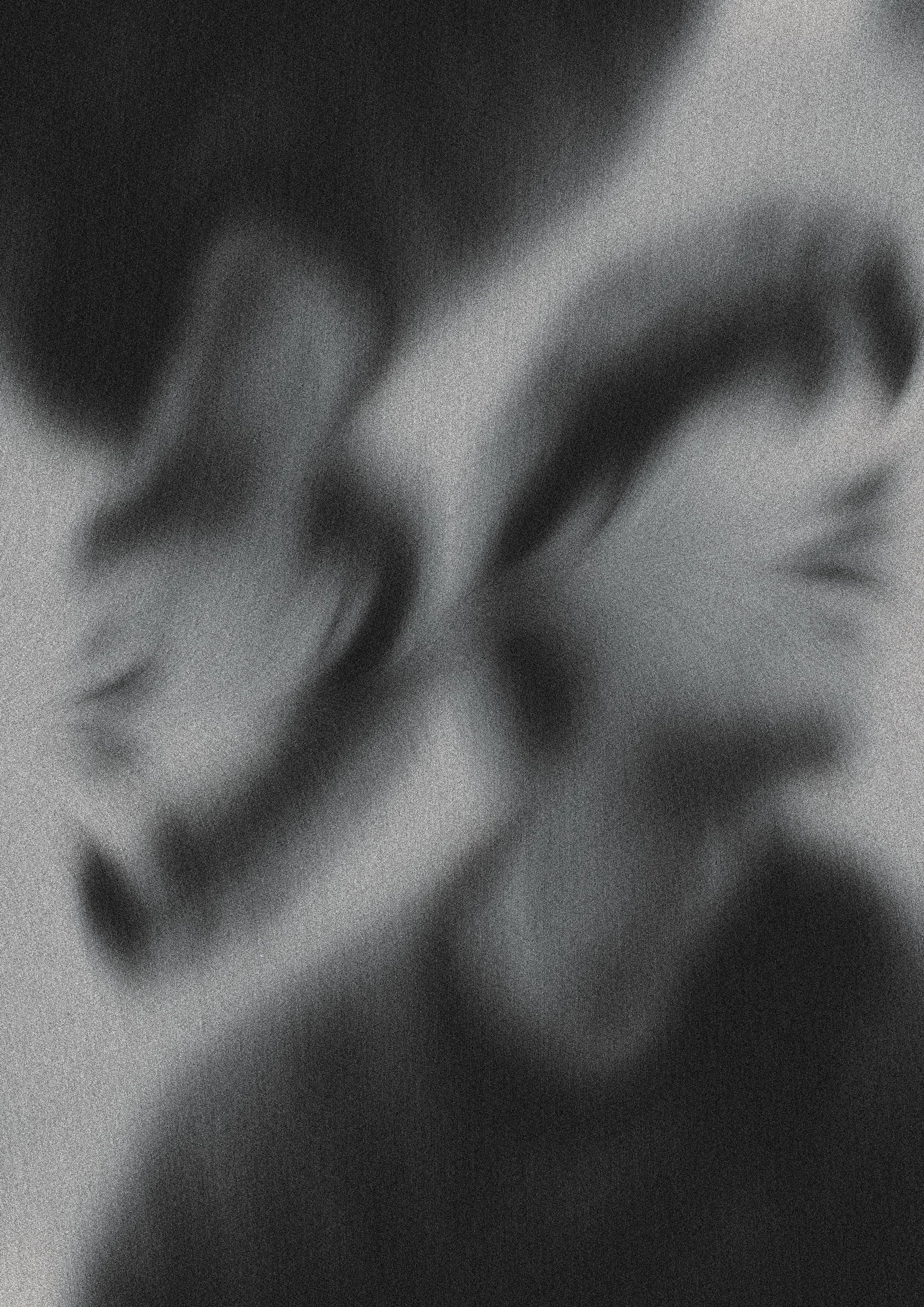
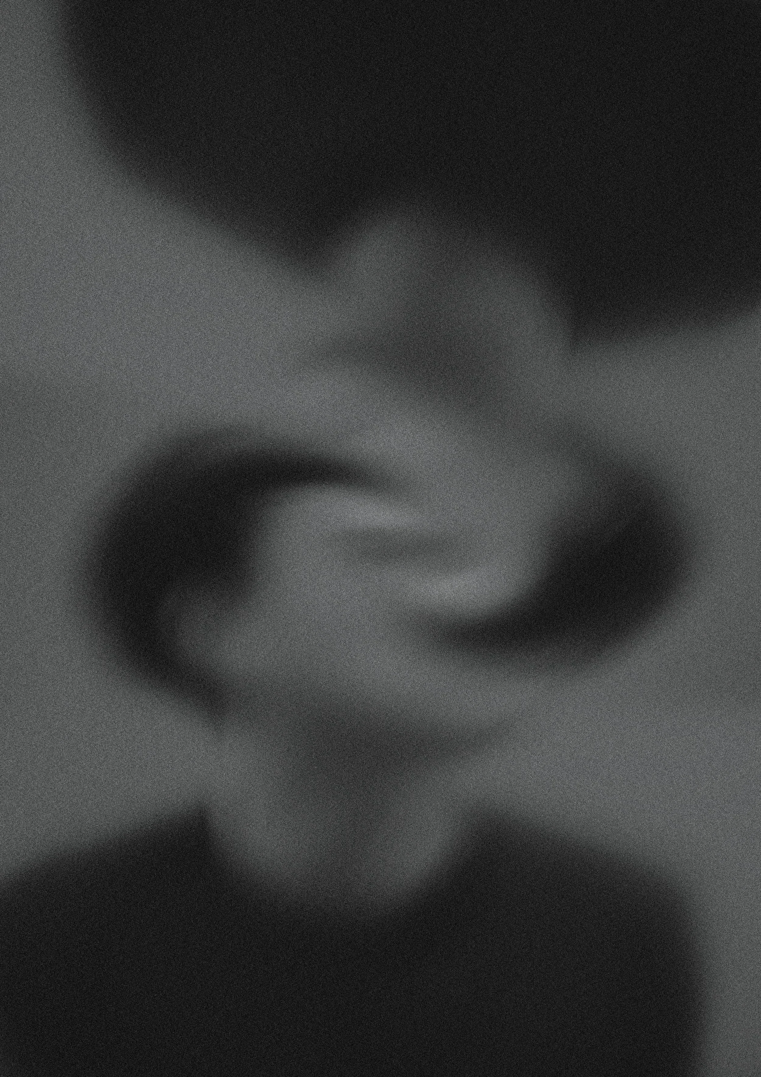


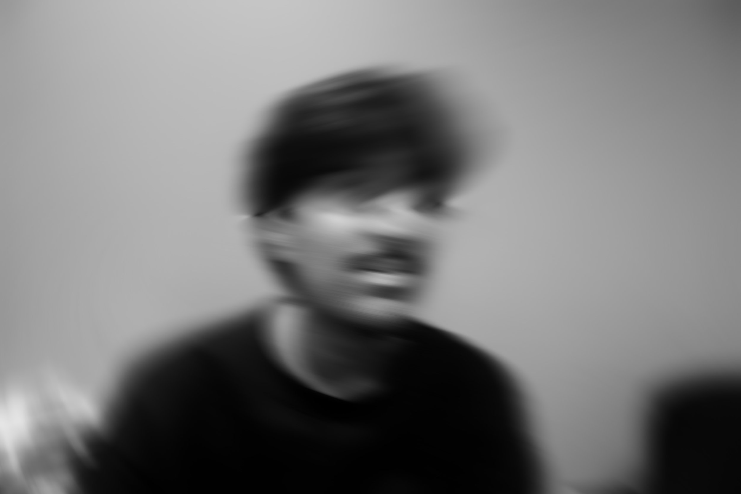
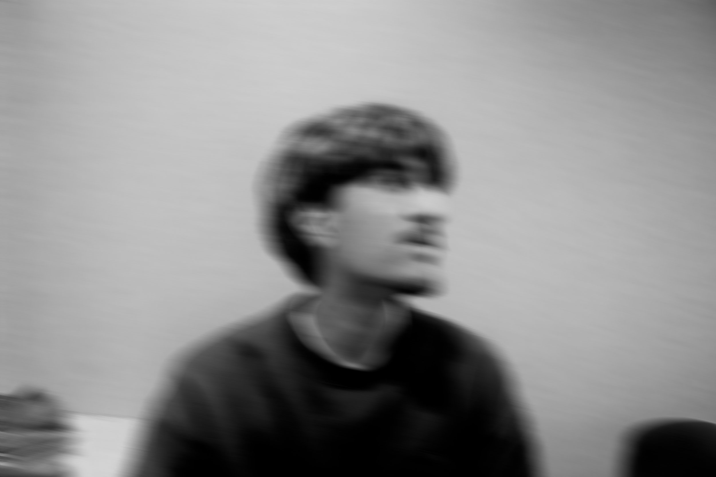
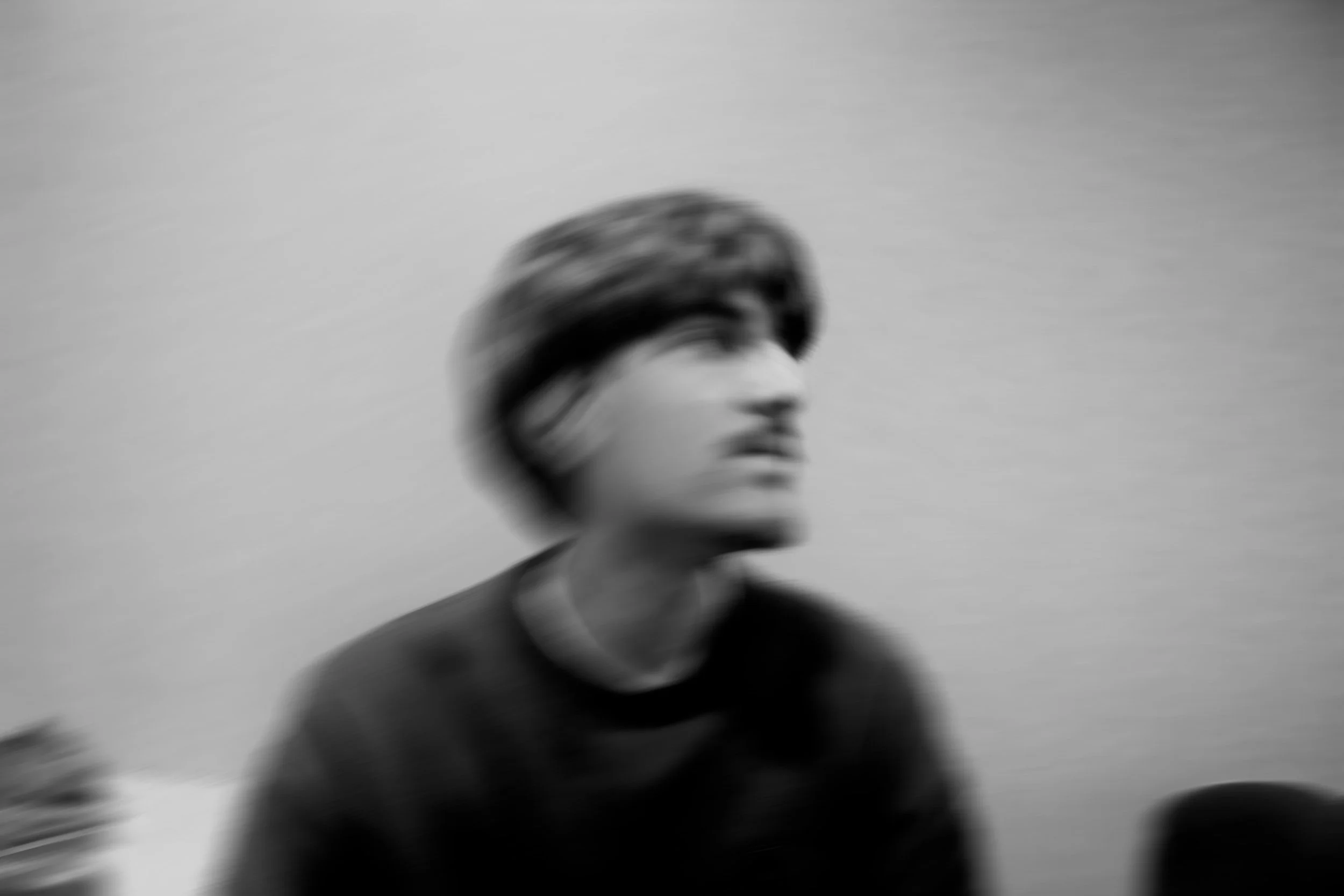
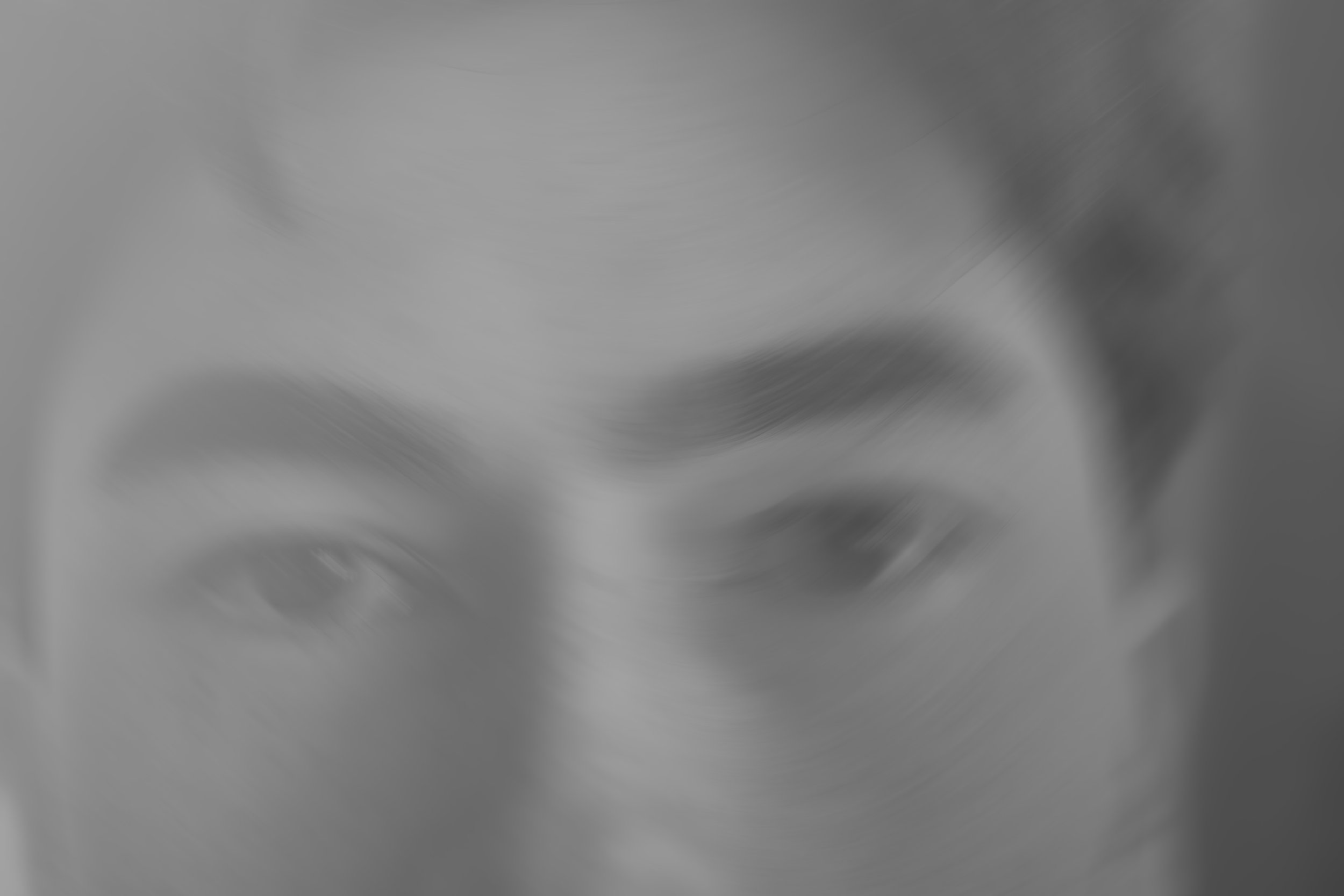
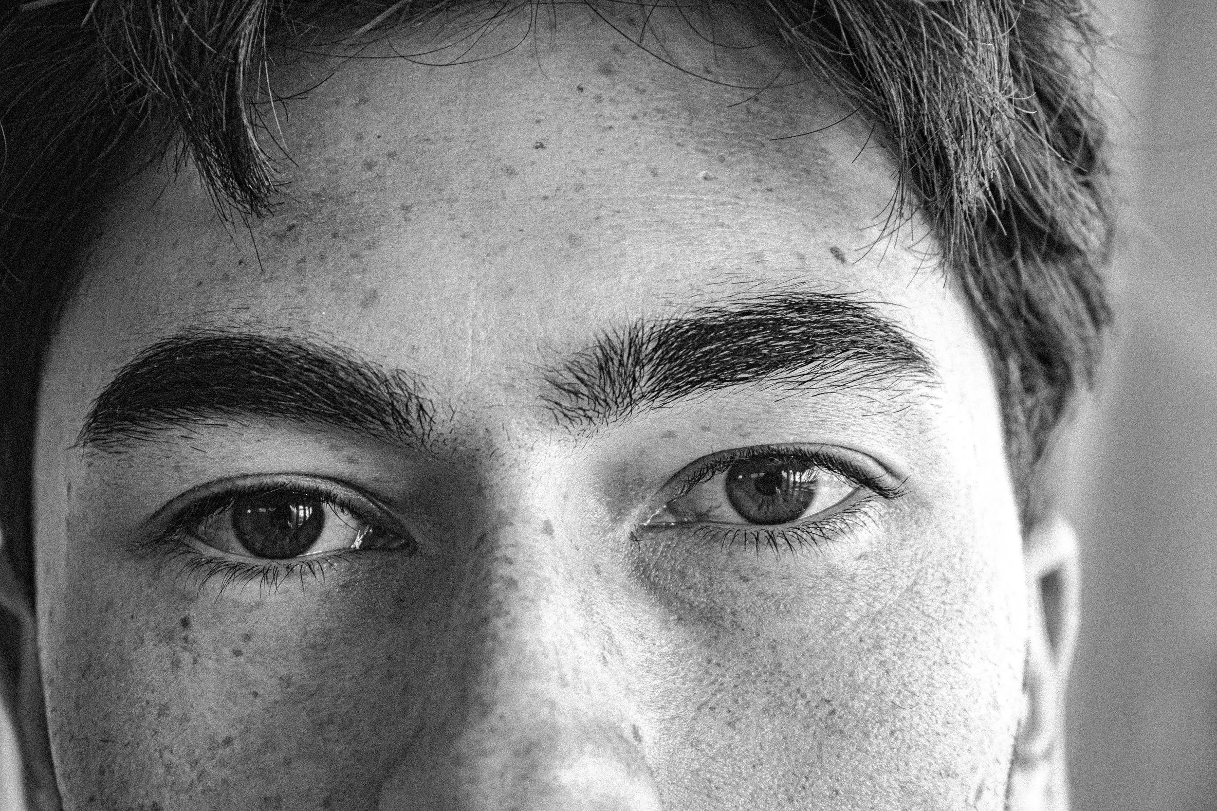
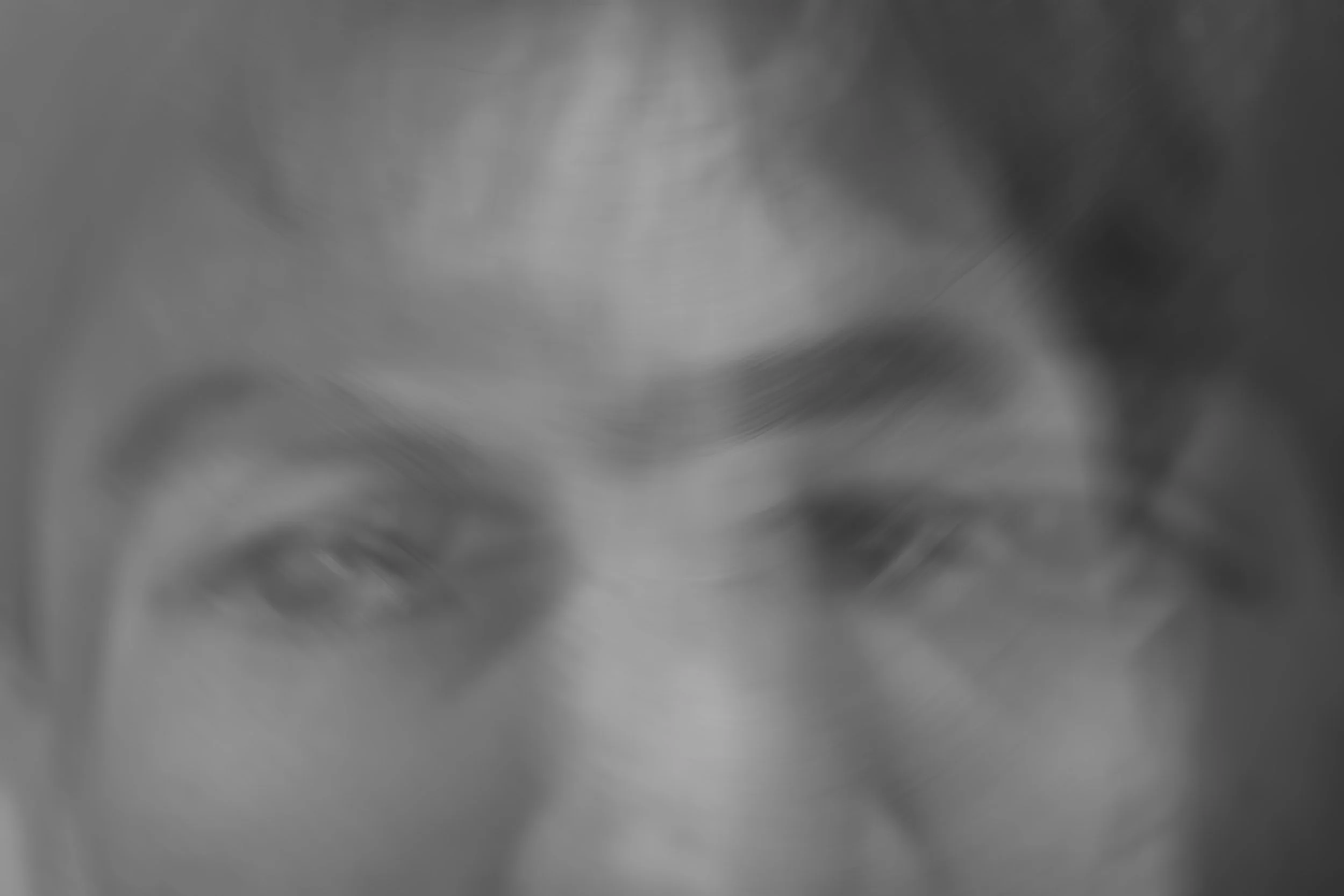
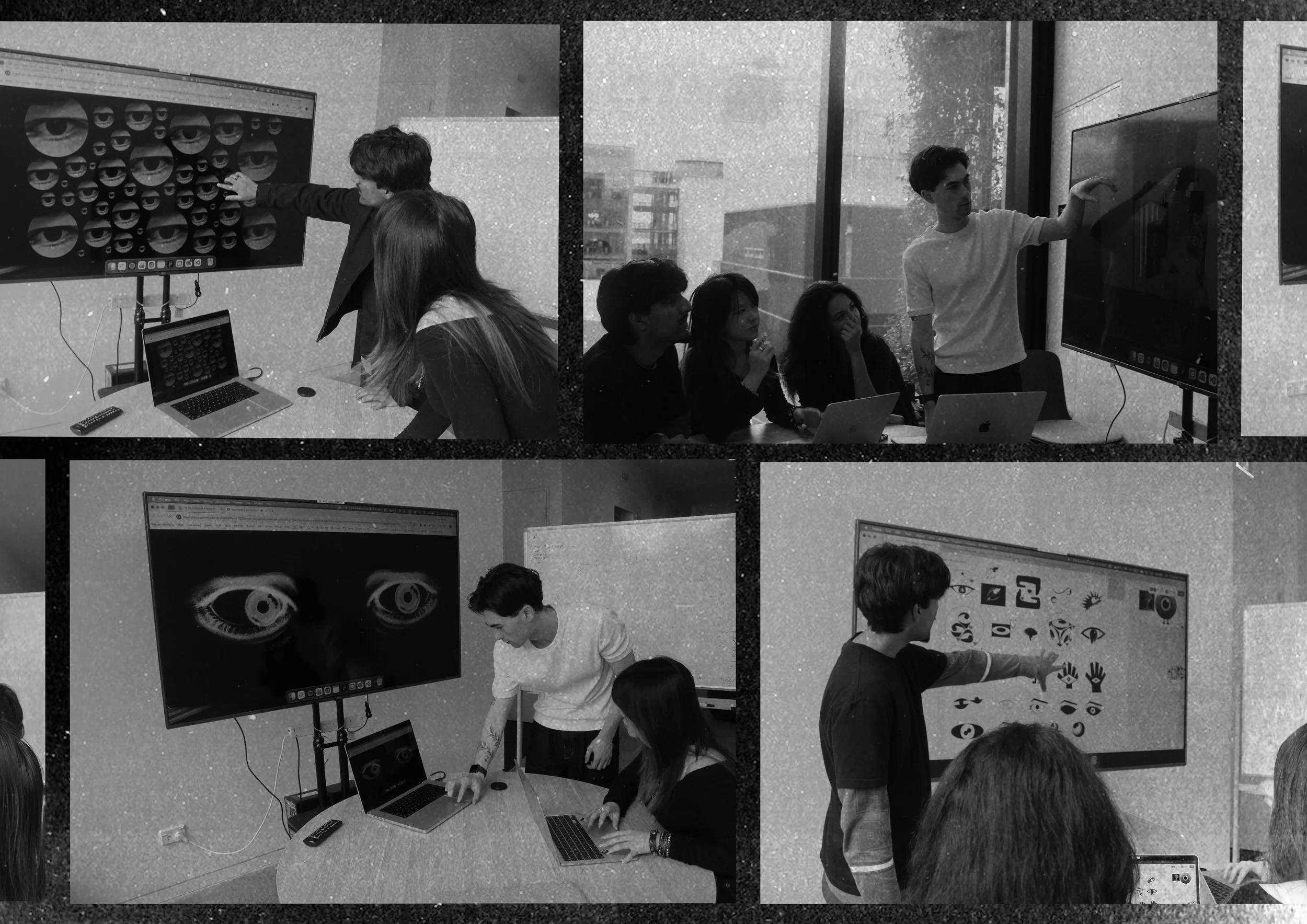
PHOTOGRAPHY
A core element of visualising the brand was the photography direction. Group member Jaron and I captured a series of close-up photographs of our own body parts, which were then heavily manipulated during post-production. Through warping, distortion, layering, and abstraction, the images were transformed into uncanny and surreal compositions that established the project’s distinctive visual atmosphere. These visuals became the essence of the brand identity, carrying through promotional material, the website, and a wide range of supporting design applications.